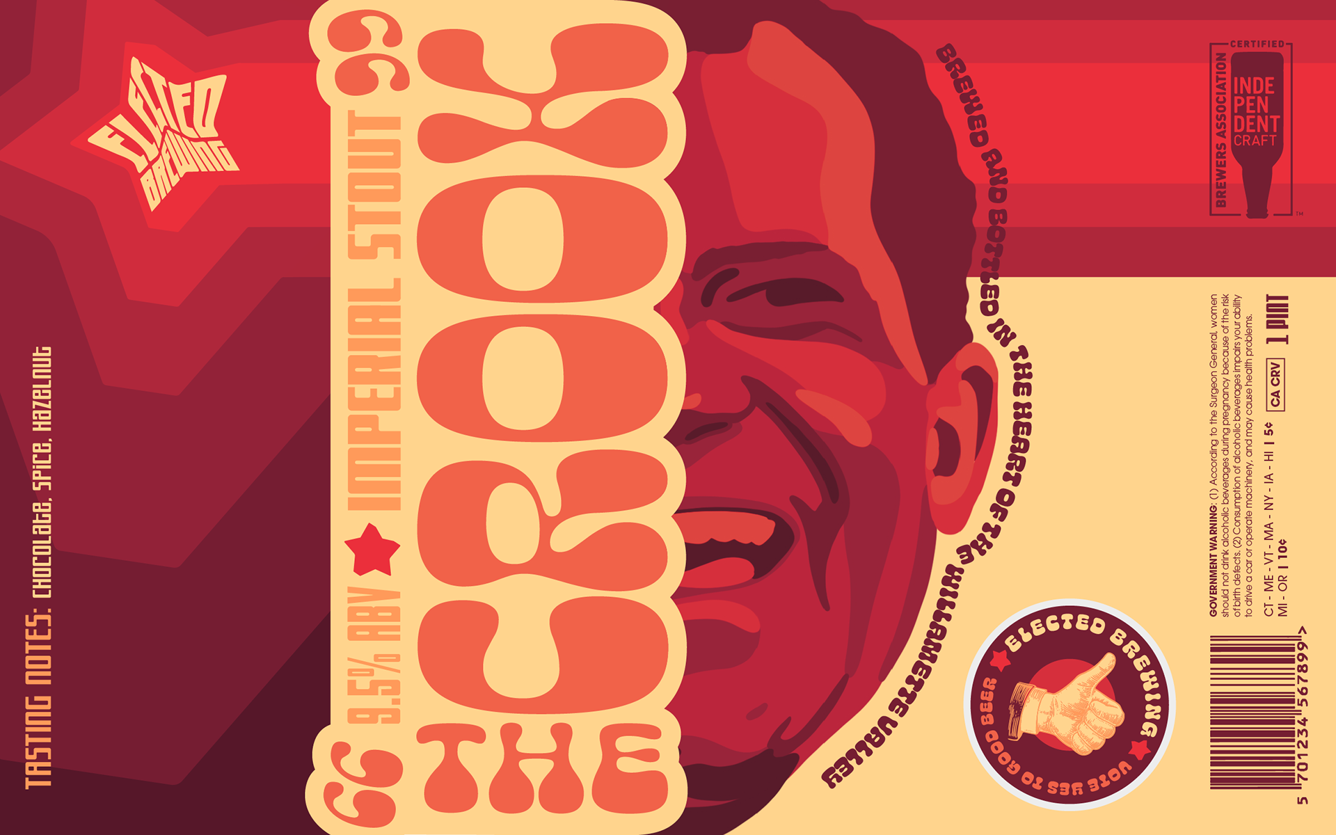
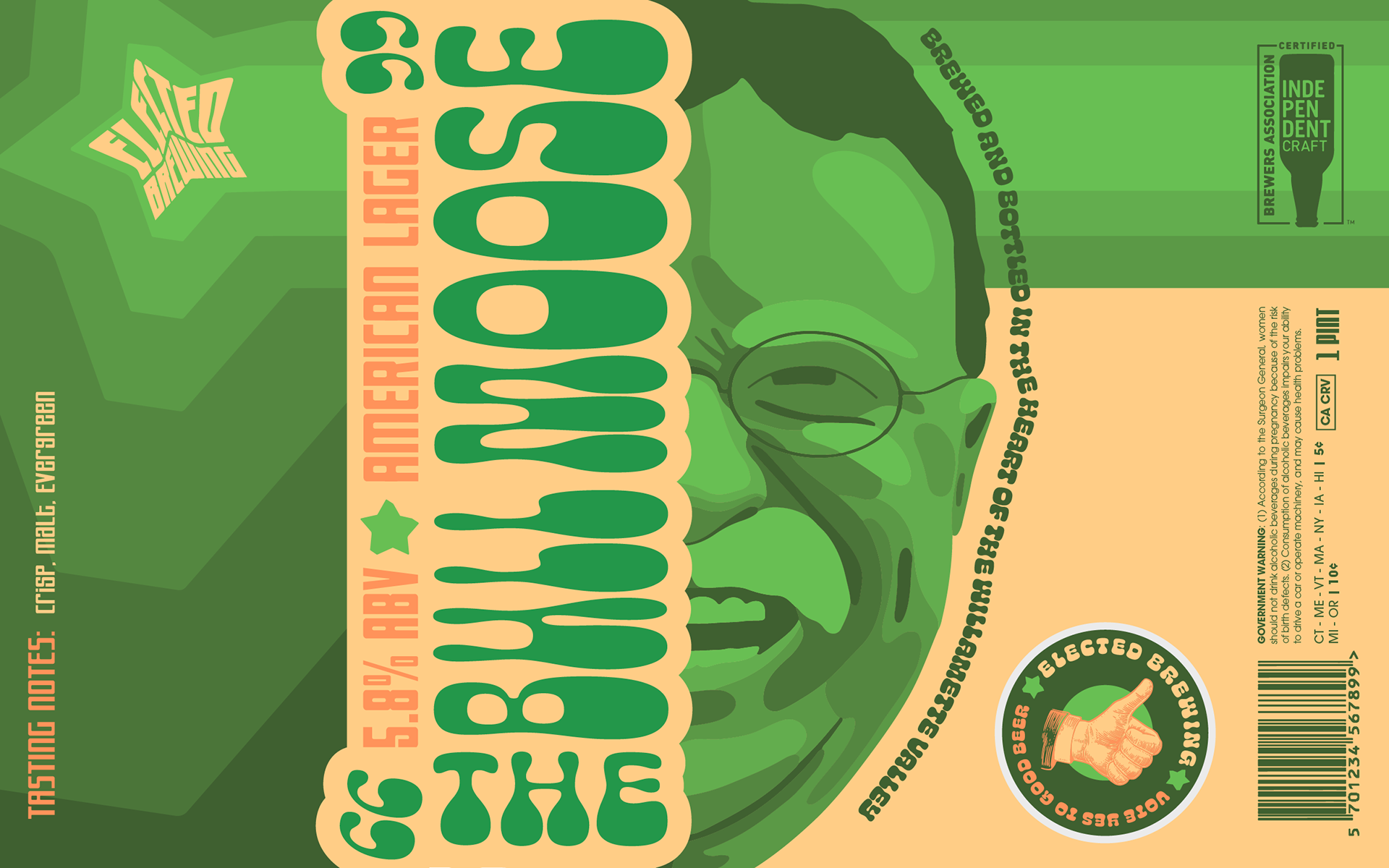
This is the themed beverage company branding project. The design of the entire brand was based on a theme chosen from a list of options. I chose political figures. On top of this, three separate can or bottle designs were requested, and were to showcase expressive typography. Now, I was born and raised in the USA so when I think political figures I think of US presidents, and I knew from the get go Richard Nixon needed to be one of my designs. So that was my jumping off point for what would become Elected Brewing.
Nixon’s “The Crook” design was my first of the bunch, and the jumping off point for my idea as a whole. When I picked the political figures category for this assignment, Nixon was the first person I thought of with his notorious, “I’m not a crook,” line. Him being in office in the 70’s really inspired me to go for this sort of 70’s retro vibe for the whole brewing company.


My 70’s styling was also picked for the heavy use of stripes within design during that time. This brewing company being based around US presidents, the good old “stars and stripes” I thought would be a good way to tie the whole design together. I also chose two pretty bold fonts I thought embodied a funky 70’s style as well. All of my decisions were to make this brewing company feel like a revitalized take on a classic era of design.
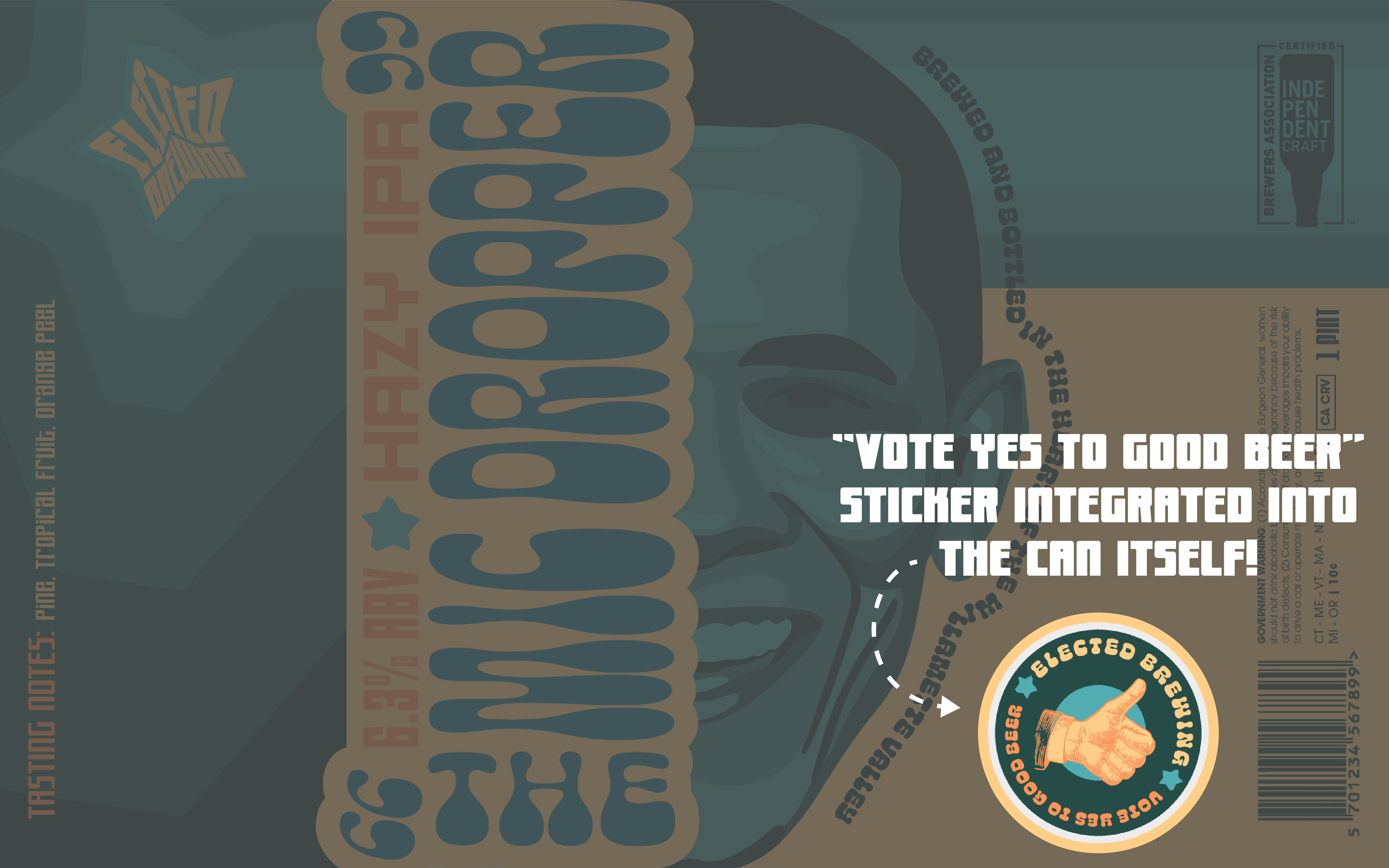
I really wanted my final designs to have something different than the rest of the competition on the market. So I started thinking about some cool or interesting things I could do with the design to set it apart. My strongest idea I came to revolved around interactivity with the brand itself. Why not make some part of the can interactive? So I came up with an idea to put an “I Voted” sticker within the beer label itself. So every can of beer someone buys they get a sticker that says, “vote yes to good beer” for essentially free. And who doesn’t like free stuff? Plus, this is the type of thing to pull somebody in and really get them on board with something fun.
