The 'B-Company' rebrand. The main objective was to rebrand a company that doesn't have substantial brand loyalty baggage. Using research on the business itself and their respective field, I was to find out who the company is at it's core, their target audience, and create an identity that's best fit for them. I chose the Oregon based knife manufacturing company Kershaw. This is one of my most expansive college career works, spanning eight weeks with many rounds of revision and critique.


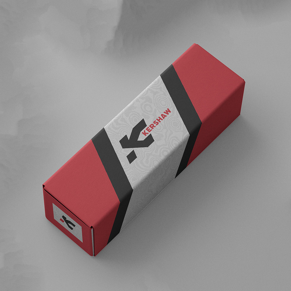
These are my final deliverables. A brand stylescape showcasing the visual styling and position the brand is taking, as well as the brand in action. Firstly, the logo engraved on a knife to show it's use on product, a knife box to showcase brand packaging, and stationary to be used by the company.
I really wanted Kershaw to embody a person and a place. They are Oregonians, they live in the woods and they design products that are rugged and durable like themselves. They are also intelligent forward thinkers, planning and designing the latest innovations in the knife making industry. My final design is a marriage of those two ideals. A knife company without the frills and feathers, but tough enough and smart enough for any job, in any landscape.


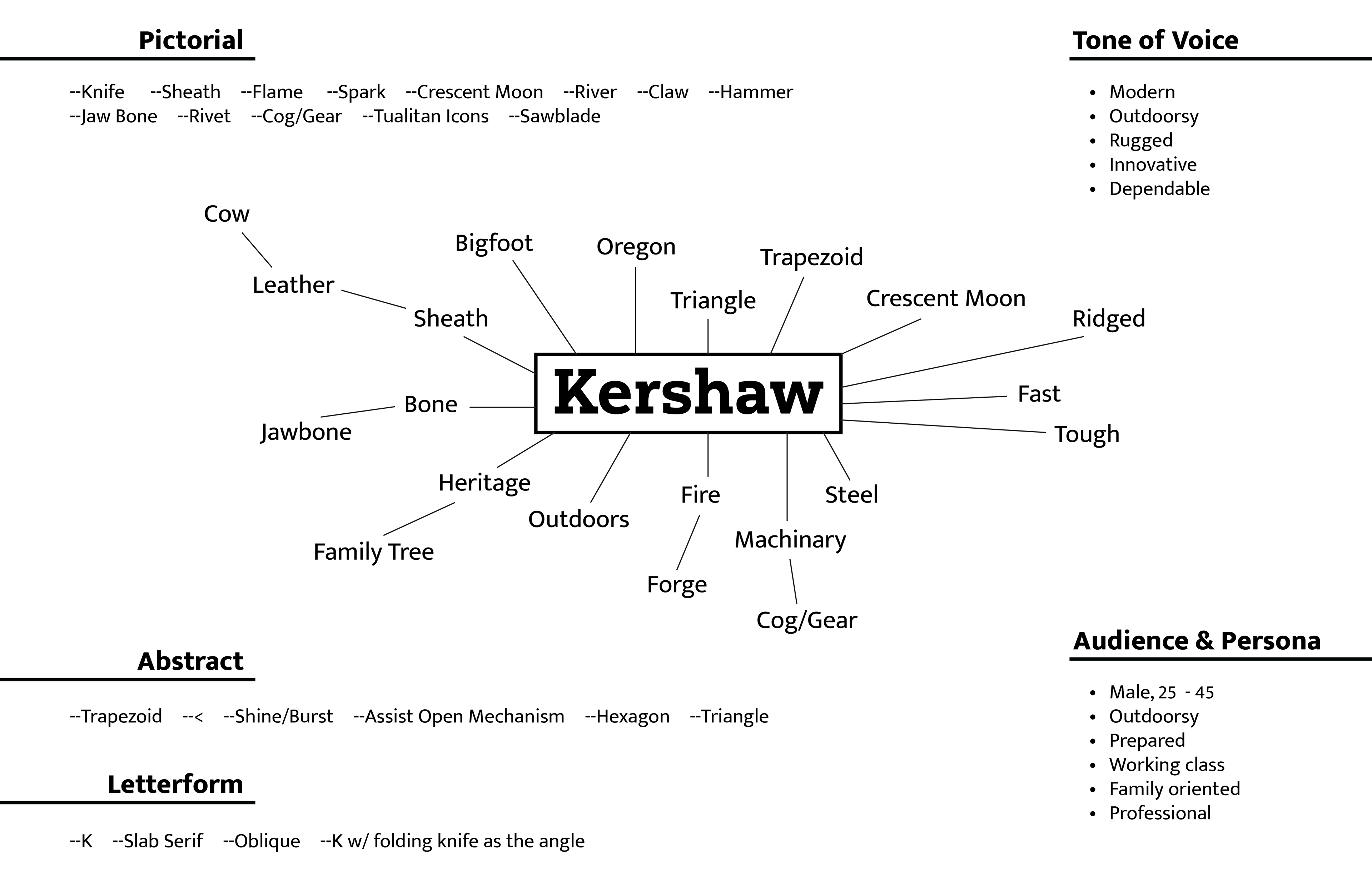
These are the preliminary and first steps of my process. I started with a mind map of the company to get my ideas going; deciding on things like tone of voice, and giving my target audience a persona.
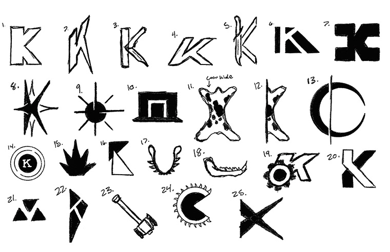
This project was based around creating an identity, but it started with the creation of either a pictorial or letter form logo. My initial sketches were a good mix of both, just exploring the tone of voice I had set and what I thought the company represented. The three logos to the left were the sketches I decided to move forward with after the first round of critique. I ultimately decided on the center logo as my jumping off point for the final.
This is the final evolution for my Kershaw logo. I found my way to the logo final logo for a few specific reasons. I felt that disconnecting the spine of the K, as well as slanting it forwards, gave it the innovative feeling I was looking for. This logo has forward motion, and so does Kershaw. I retained what I loved about the first version though: the strength and stability. I feel this final version really did bring together the two ideals I was hoping to couple with this brand.
