The Portland Ramblers are my senior capstone for my BFA in Graphic Design from Oregon State. I am a huge hockey fan, specifically the Detroit Red Wings, and through my project I got to bring an NHL team to my home town. The senior capstone project was an open-ended project that let me explore essentially any subject I wanted. I had a list of required deliverables for the digital submission, as well as a list of deliverables for the in-person capstone presentation gallery. This project was the culmination of many months of work, and the finally to the show that was my time at Oregon State University.
The most important part of any sports team is the name and logo. I would even go so far as to say the name and logo ARE the sports team. Every franchise has their time in the sun, a franchise player that defines them, a name hung up in the rafters and a number retired. But the player has to retire eventually and what they leave behind is a legacy of highlight reals and championship victories while wearing the name and logo of their team.
So when I started this project I spent hours trying to think of a name that fit Portland, and something I thought the city could rally around. I knew I didn't want to approach anything lumber or forestry related because of the Portland Timbers MLS team, and nothing related to the Oregon Trail due to the Trail Blazers NBA team, but I still wanted a name that resonated with the city. So after a lot of thought, I decided to pick a name that echoed Portlands adventurous spirit. A Rambler is a wanderer, a traveler, an explorer; someone with the thirst for living life to the fullest. Portland being the bridge city, among many other nick names, I thought would be the perfect basis for the visual identity for the Ramblers. The idea of the bridge being a means of travel and a unifying force for the city solidified the final concept for me.
I made a few different bridge designs, but ultimately based my design around the St. Johns. It is arguably Portlands most iconic bridge and an instant symbol for the people of the city to rally around. The design of the bridge also lent itself nicely to this badge or shield type design which is synonymous with the NHL.
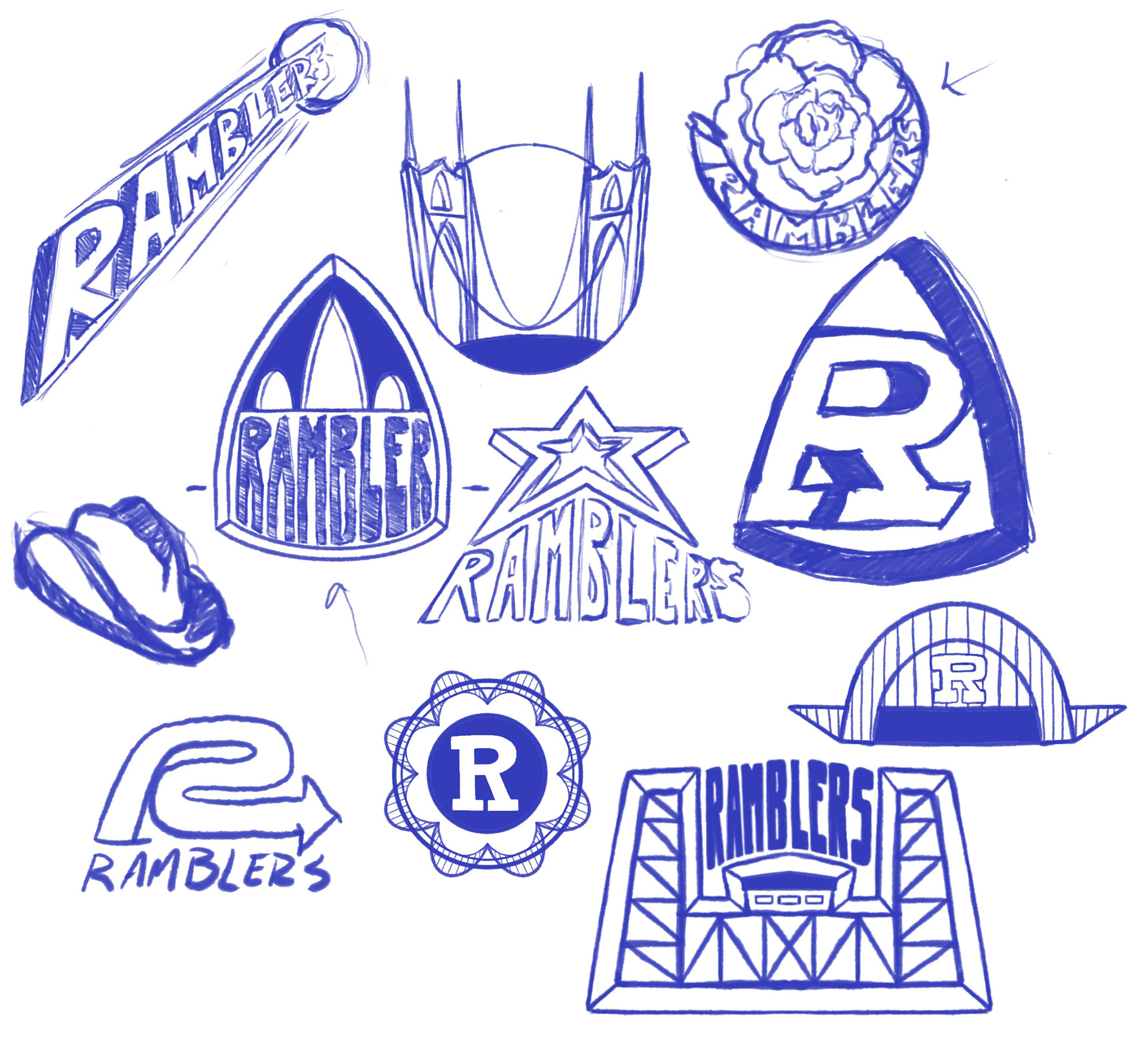
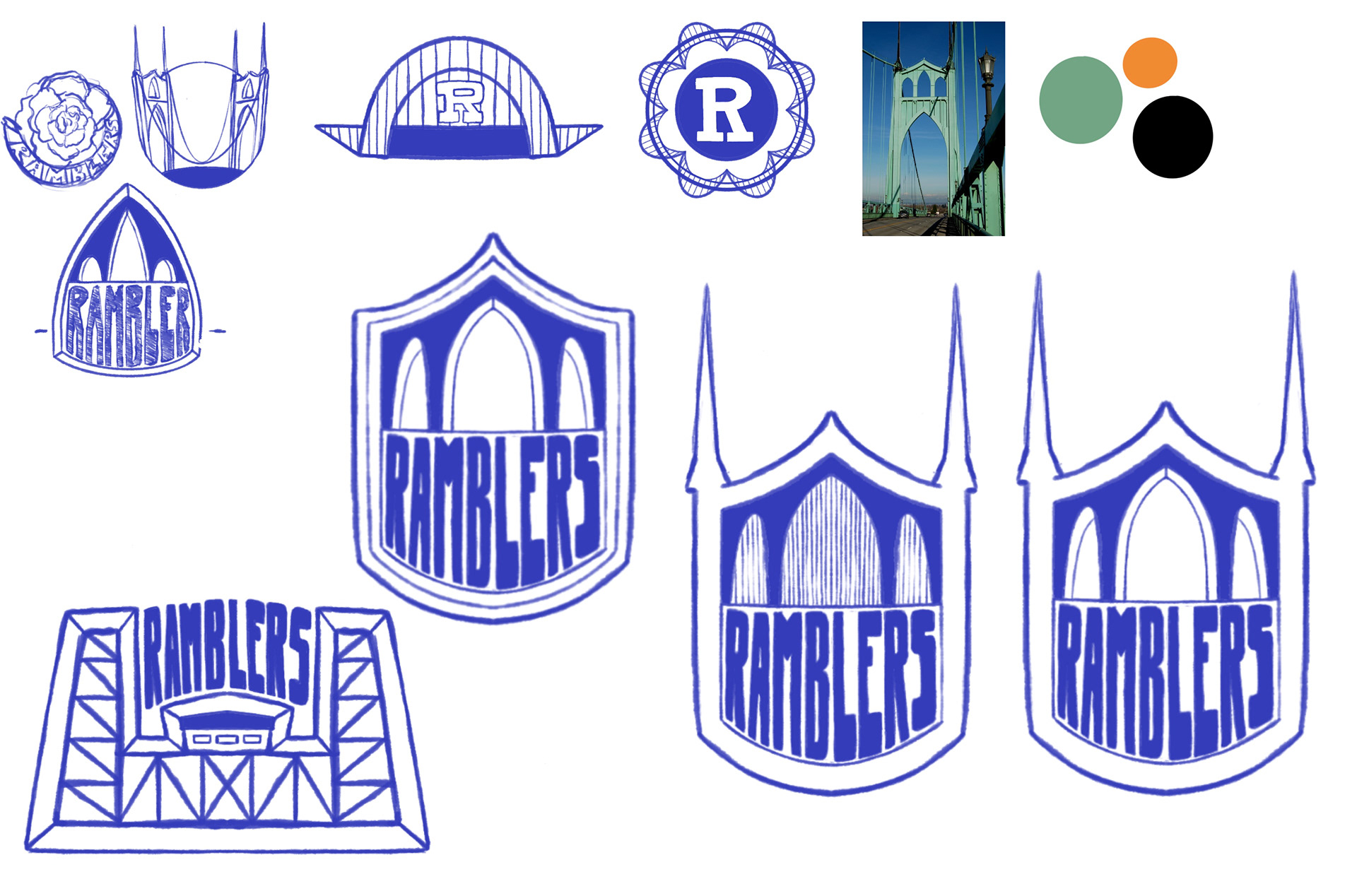
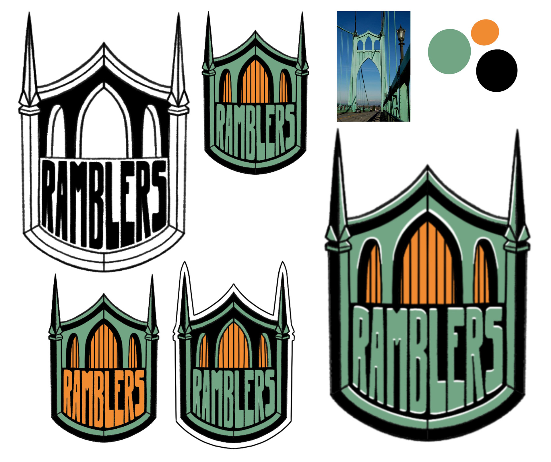
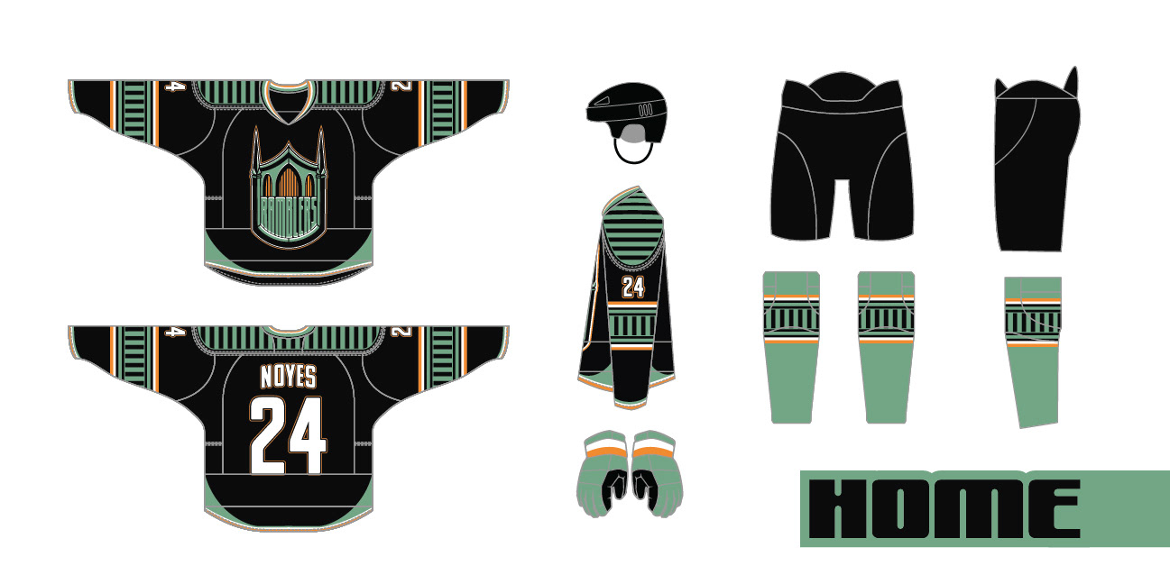
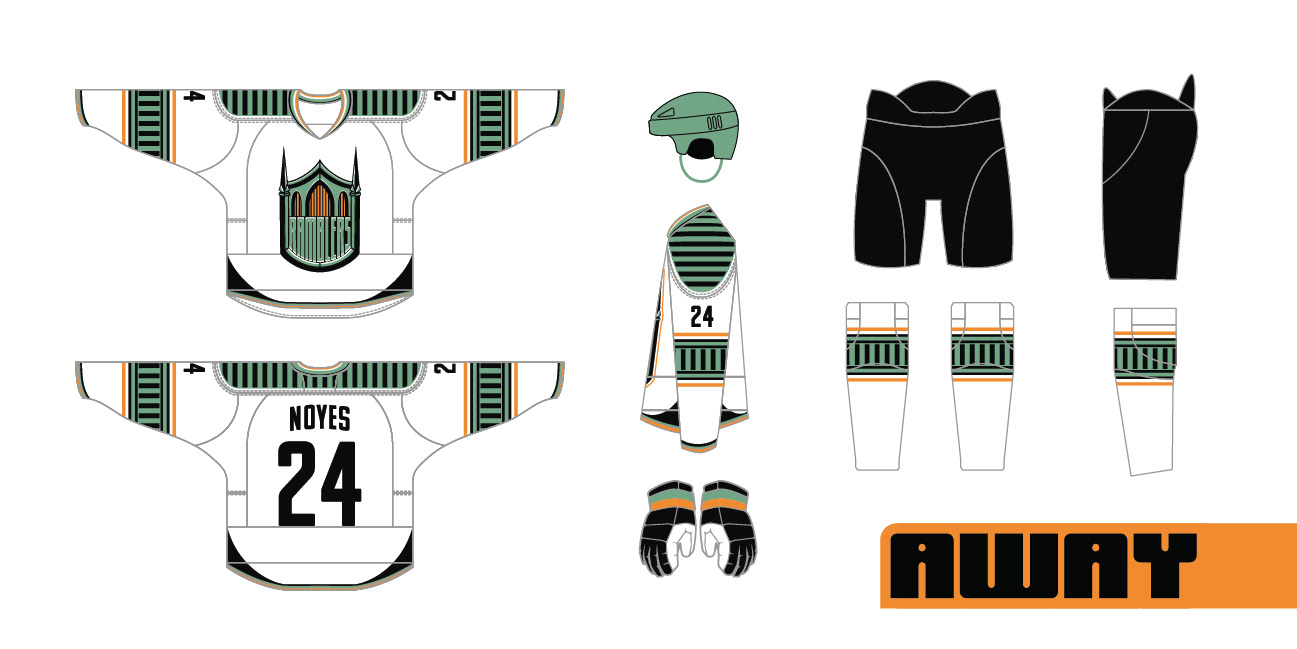
I wanted both the logo and jersey designs to feel classic, but reimagined for the modern era. As I said before, the shield or badge shaped logo is a classic in the NHL and hockey in general. Another common design for jerseys in hockey is horizontal striping, either on the arms or around the bottom hem. My design incorporates vertical striping within a horizontal band, this is a call to the St. Johns Bridge itself. Because the St. Johns is a suspension bridge, it has dozens of vertical support cables attaching the roadway to the main arches. The vertical lines of the jersey are meant to symbolize those supports. There is no other team in the NHL that incorporates this kind of design element, and I love that it sets this team apart from the rest while maintaining a classic feel.
My ultimate goal for this project was to create an identity for a team I thought Portlanders would immediately resonate with. Portland already has a successful minor hockey team in the Winterhawks, a professional sports arena that is NHL ready, and a somewhat untaped sports market. Portland only has two pro sports teams, and hockey is very unique when compared to them. We also have an established hockey culture here that is just waiting to be expanded with the excitement that comes with a professional team. I truly think that hockey would thrive in the bridge city, and the Ramblers are the team to bring it here.
